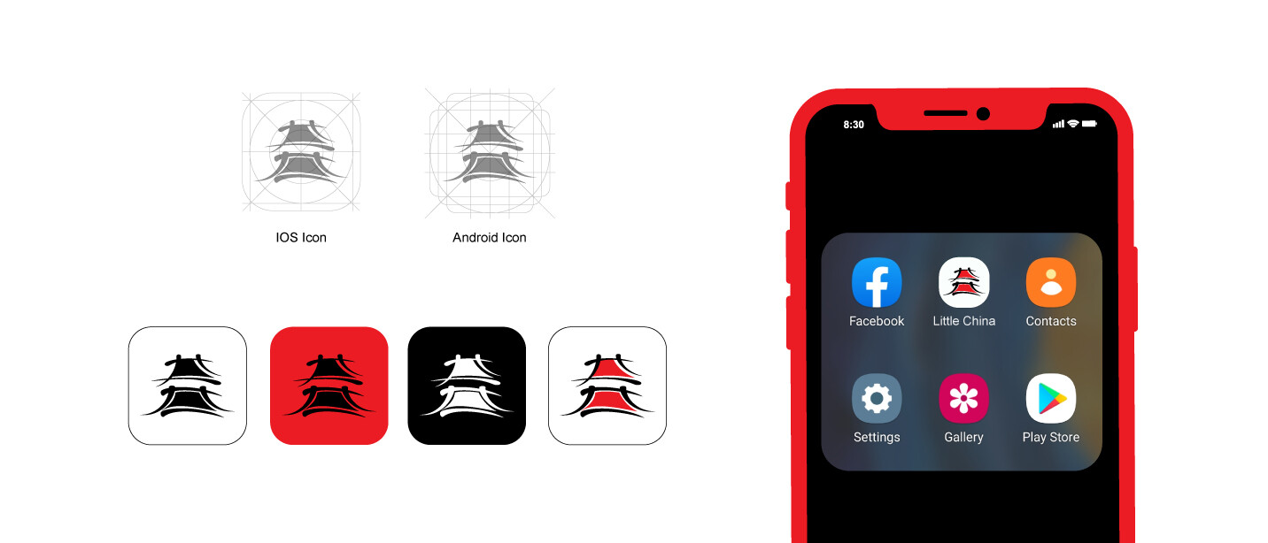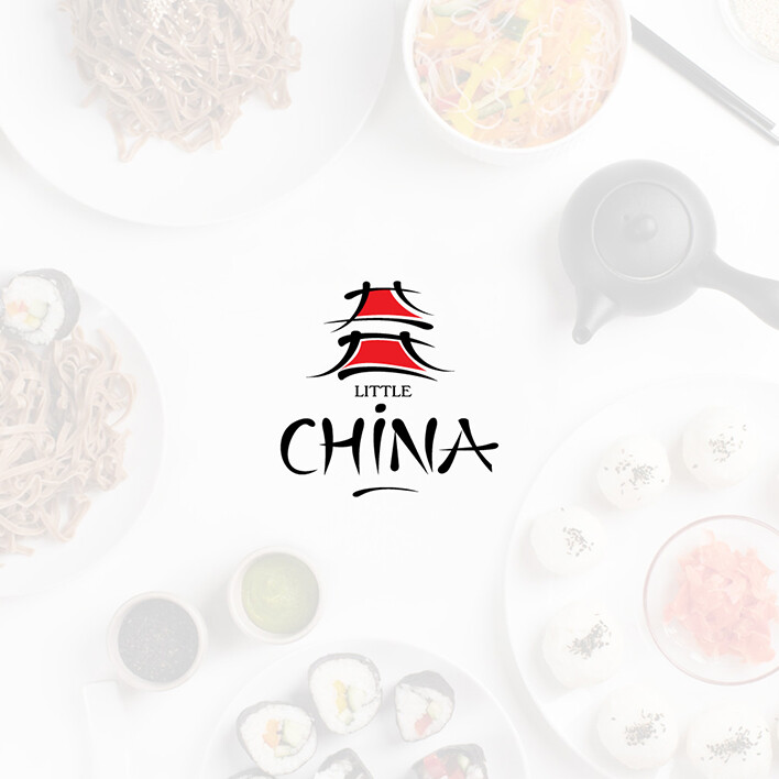
When Little China came to us, their brand and logo were struggling to attract customers. The logo felt outdated, and there was no cohesion in the branding. They needed a solution that would resonate with a wider audience while clearly reflecting their identity. One key requirement was to keep the branding minimal, using a limited colour palette to honour their national heritage.
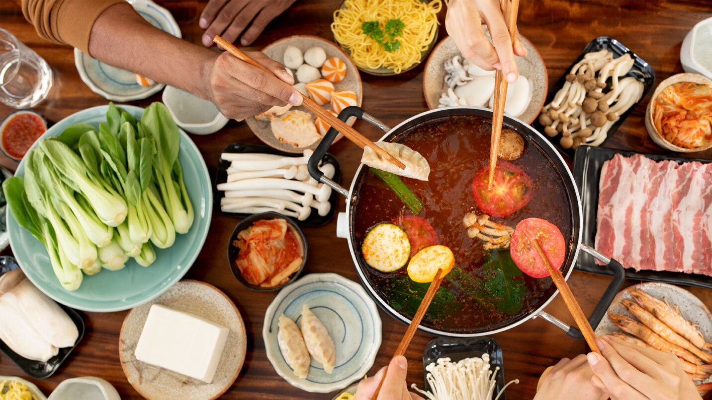
Understanding their need for a fresh, impactful brand identity that still embraced their roots, we set out to create a cohesive solution that would help boost their restaurant’s visibility and sales. To gain deeper insight, we fully immersed ourselves in the Little China experience—ordering, tasting, and understanding the essence of their cuisine. After thorough research, we proposed a streamlined yet distinctive brand design that captured the fast-paced energy of their business, uniting both the restaurant and its customers around a shared love for their incredible food.
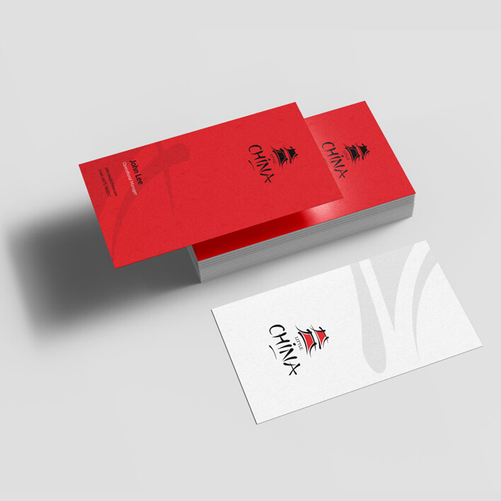
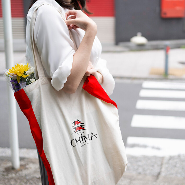
The result was a highly visual brand identity that transcended language and cultural barriers. We introduced bold, eye-catching colours and developed a unique food photography style that truly showcased their delicious offerings. The new branding has successfully attracted new customers, many of whom were previously unaware of the restaurant, providing a much-needed boost in sales.